Proteomics assay data
Proteomics assay data
Assays for high-throughput proteomics have recently become available, allowing the screening of thousands of proteins in large number of samples. Two technologies are currently widely encountered: aptamers and antibodies (ref). Both provide data in a tabular format with the protein abundance estimates for every sample.
Libraries
We will need the following libraries. If they are not availble on your
system, use the ìnstall_packages command to install them.
library(janitor) # A package to clean dirty data

##
## Attaching package: 'janitor'

## The following objects are masked from 'package:stats':
##
##     chisq.test, fisher.test

library(tidyr) # A package to tidy data
library(dplyr) # A package to manipulate data

##
## Attaching package: 'dplyr'

## The following objects are masked from 'package:stats':
##
##     filter, lag

## The following objects are masked from 'package:base':
##
##     intersect, setdiff, setequal, union

library(parallel) # A package to run tasks in parallel
library(glue) # A package to glue variables in strings
library(stringr) # A package to manipulate strings

library(ggplot2) # A package to plot data
library(scico) # A package of scientific color palettes

library(conflicted) # A package to manage namespace conflicts

# Resolve conflicting function names
conflict_prefer("filter", "dplyr")

## [conflicted] Will prefer dplyr::filter over any other package

# Set the theme for plots
theme_set(theme_bw(base_size = 13))
Load data
:pencil2: Open the data set available at these links: - link1 - link2 - link3
files_folder <- "/home/marc/Projects/tutorials/data"

protein_values <- read.table(
  file = file.path(files_folder, "soma_example.gz"),
  header = T,
  sep = "\t",
  stringsAsFactors = F
) %>%
  clean_names() # This function makes the formatting of the column names uniform, note that it transforms the identifiers of the proteins

# write.table(
#   x = protein_values,
#   col.names = T,
#   row.names = F,
#   sep = "\t",
#   file = file.path(files_folder, "soma_example.gz")
# )

samples_details <- read.table(
  file = file.path(files_folder, "soma_example_2.gz"),
  header = T,
  sep = "\t",
  stringsAsFactors = F
) %>%
  clean_names()

protein_details <- read.table(
  file = file.path(files_folder, "soma_example_3.gz"),
  header = T,
  sep = "\t",
  stringsAsFactors = F,
  comment.char = ""
) %>%
  clean_names() %>%
  mutate(
    protein_id = paste0("x", str_replace_all(string = seq_id, pattern = "-", replacement = "_")) # Note that we create a column to match identifiers with the column names of the protein_values
  )
:speech_balloon: What is shown in row/columns in each file? How many proteins were measured in how many samples?
Abundance estimates standardization
:pencil2: Select a sample and make a histogram of the protein abundance estimates.
selected_sample <- sample(samples_details$id, 1)

selected_sample_values <- protein_values %>%
  filter(
    sample_id == selected_sample
  ) %>%
  select(
    starts_with("x")
  ) %>%
  pivot_longer(
    cols = starts_with("x")
  )

ggplot() +
  geom_histogram(
    data = selected_sample_values,
    mapping = aes(
      x = value
    ),
    bins = 50,
    col = "darkblue",
    fill = "darkblue",
    alpha = 0.4
  ) +
  scale_x_continuous(
    name = glue("Abundance estimate for sample {selected_sample}")
  ) +
  scale_y_continuous(
    name = glue("Number of proteins"),
    expand = expansion(
      mult = c(0, 0.05)
    )
  )
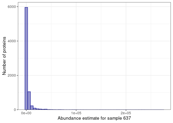
:speech_balloon: Is this what you would expect when looking at the proteome of a sample?
:pencil2: Select a protein and look at the distribution of abundance estimates.
selected_protein <- sample(protein_details$protein_id, 1)

ggplot() +
  geom_histogram(
    data = protein_values,
    mapping = aes(
      x = !!sym(selected_protein)
    ),
    bins = 50,
    col = "darkgreen",
    fill = "darkgreen",
    alpha = 0.4
  ) +
  scale_x_continuous(
    name = glue("Abundance estimate of {selected_protein}")
  ) +
  scale_y_continuous(
    name = glue("Number of samples"),
    expand = expansion(
      mult = c(0, 0.05)
    )
  )
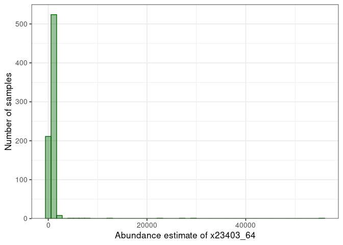
:speech_balloon: How does the distribution looks like? How will it influence downstream analyses?
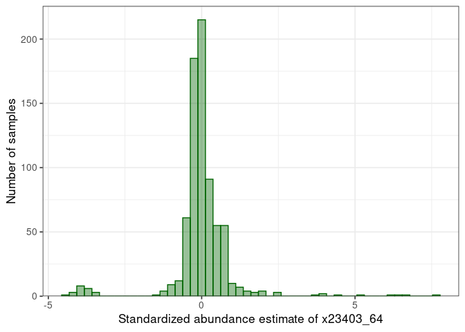
:pencil2: Log, center, and scale the abundance of each protein.
for (protein in protein_details$protein_id) {

  log_values <- log10(protein_values[[protein]][protein_values$sample_id %in% samples_details$id & !is.na(protein_values[[protein]]) & protein_values[[protein]] > 0])

  if (length(log_values) < 10) {
    stop(glue("Too few values for protein {protein}"))
  }

  mean_log <- mean(log_values, na.rm = T)
  sd_log <- sd(log_values, na.rm = T)

  new_column <- paste0(protein, "_log_std")

  protein_values[[new_column]] <- ifelse(protein_values$sample_id %in% samples_details$id & !is.na(protein_values[[protein]]) & protein_values[[protein]] > 0, (log10(protein_values[[protein]]) - mean_log) / sd_log, NA)

}
:pencil2: Plot again the distribution for the selected protein.
selected_protein_log_std <- paste0(selected_protein, "_log_std")

ggplot() +
  geom_histogram(
    data = protein_values,
    mapping = aes(
      x = !!sym(selected_protein_log_std)
    ),
    bins = 50,
    col = "darkgreen",
    fill = "darkgreen",
    alpha = 0.4
  ) +
  scale_x_continuous(
    name = glue("Standardized abundance estimate of {selected_protein}")
  ) +
  scale_y_continuous(
    name = glue("Number of samples"),
    expand = expansion(
      mult = c(0, 0.05)
    )
  )

## Warning: Removed 3 rows containing non-finite values (stat_bin).
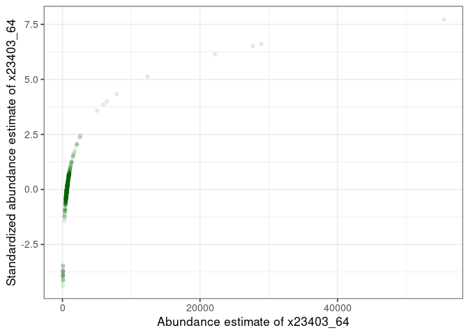
:pencil2: Plot the standardized vs non-standardized values.
ggplot() +
  geom_point(
    data = protein_values,
    mapping = aes(
      x = !!sym(selected_protein),
      y = !!sym(selected_protein_log_std)
    ),
    col = "darkgreen",
    alpha = 0.1
  ) +
  scale_x_continuous(
    name = glue("Abundance estimate of {selected_protein}")
  ) +
  scale_y_continuous(
    name = glue("Standardized abundance estimate of {selected_protein}")
  )

## Warning: Removed 3 rows containing missing values (geom_point).
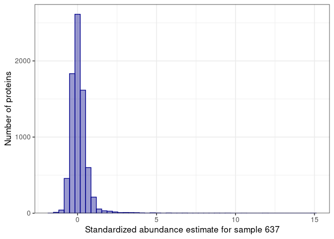
:pencil2: Plot again the distribution for the selected sample.
selected_sample_std_values <- protein_values %>%
  filter(
    sample_id == selected_sample
  ) %>%
  select(
    ends_with("_log_std")
  ) %>%
  pivot_longer(
    cols = ends_with("_log_std")
  )

ggplot() +
  geom_histogram(
    data = selected_sample_std_values,
    mapping = aes(
      x = value
    ),
    bins = 50,
    col = "darkblue",
    fill = "darkblue",
    alpha = 0.4
  ) +
  scale_x_continuous(
    name = glue("Standardized abundance estimate for sample {selected_sample}")
  ) +
  scale_y_continuous(
    name = glue("Number of proteins"),
    expand = expansion(
      mult = c(0, 0.05)
    )
  )
:pencil2: Plot the standardized vs non-standardized values.
plot_values <- merge(selected_sample_values, selected_sample_std_values %>% rename(std_value = value) %>% mutate(name = str_remove(name, "_log_std")), by = "name")

ggplot() +
  geom_point(
    data = plot_values,
    mapping = aes(
      x = value,
      y = std_value
    ),
    col = "darkblue",
    alpha = 0.1
  ) +
  scale_x_continuous(
    name = glue("Protein abundance estimate for {selected_sample}")
  ) +
  scale_y_continuous(
    name = glue("Standardized abundance estimate for {selected_sample}")
  )
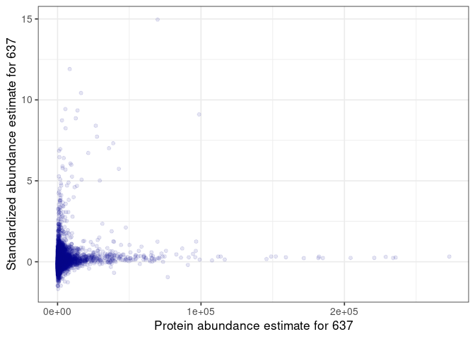
:speech_balloon: How do you interpret this plot?
Principal component analysis
:pencil2: Run a PCA on the standardized values.
pca_input <- protein_values %>%
  filter(
    sample_id %in% samples_details$id
  ) %>%
  select(
    sample_id, ends_with("_log_std")
  )

pca_samples <- pca_input$sample_id
pca_input <- t(pca_input[, -1])
colnames(pca_input) <- pca_samples

pca <- prcomp(pca_input)
The quantitative information is now projected in a base of dimensions ordered by decreasing amount of variance, the principal components. We can plot the dimensions capturing most of the variance from the sdev attribute of the pca result.
:pencil2: Plot the variance explained by the first ten components
eigen_values <- pca$sdev ^ 2
total_eigen_value <- sum(eigen_values)
pc_contribution <- 100 * eigen_values / total_eigen_value

ggplot() +
  geom_col(
    mapping = aes(
      x = 1:10,
      y = pc_contribution[1:10]
    )
  ) +
  scale_x_continuous(
    name = "PC"
  ) +
  scale_y_continuous(
    name = glue("Proportion of Variance [%]"),
    expand = expansion(
      mult = c(0, 0.05)
    )
  )
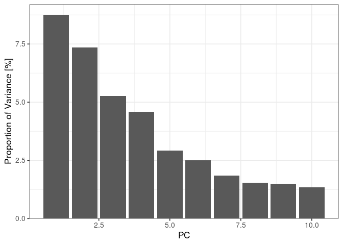
:speech_balloon: How do you interpret this plot?
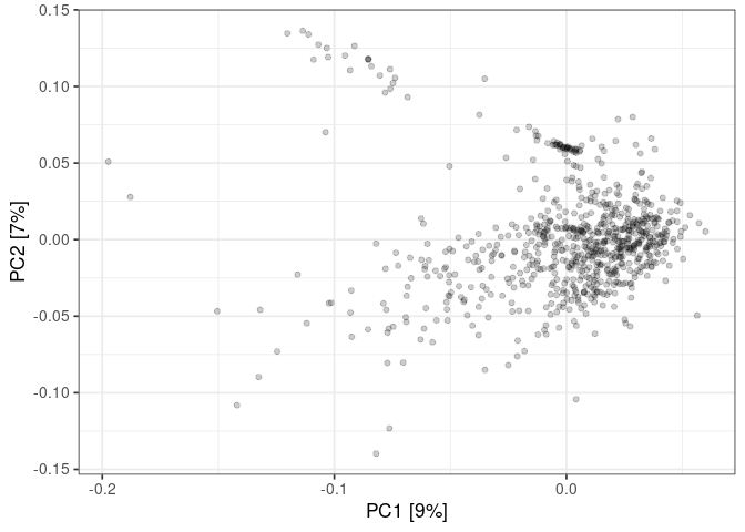
:pencil2: Plot the samples in the plane made by PC1 and PC2
pc1 <- pca$rotation[,1]
pc2 <- pca$rotation[,2]
names <- dimnames(pca$rotation)[[1]]

plot_data <- data.frame(
  pc1 = pc1,
  pc2 = pc2,
  id = names
)

contribution1 <- round(100 * eigen_values[1] / total_eigen_value)
contribution2 <- round(100 * eigen_values[2] / total_eigen_value)

ggplot() +
  geom_point(
    data = plot_data,
    mapping = aes(
      x = pc1,
      y = pc2
    ),
    alpha = 0.2
  ) +
  xlab(glue("PC1 [{contribution1}%]")) +
  ylab(glue("PC2 [{contribution2}%]"))
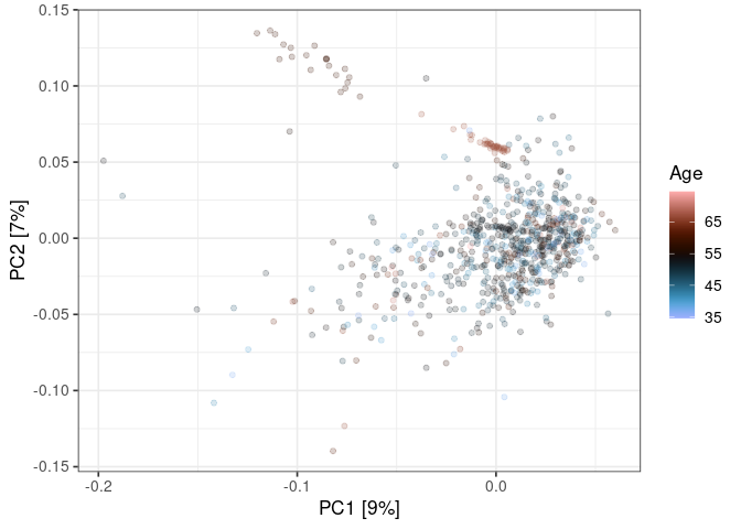
:pencil2: Color the points using the sample details.
plot_data <- plot_data %>%
  left_join(
    samples_details %>%
      mutate(
        id = as.character(id)
      ),
    by = "id"
  )

ggplot() +
  geom_point(
    data = plot_data,
    mapping = aes(
      x = pc1,
      y = pc2,
      col = age
    ),
    alpha = 0.2
  ) +
  xlab(glue("PC1 [{contribution1}%]")) +
  ylab(glue("PC2 [{contribution2}%]")) +
  scale_color_scico(
    name = "Age",
    palette = "berlin"
  )
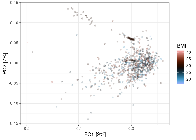
ggplot() +
  geom_point(
    data = plot_data,
    mapping = aes(
      x = pc1,
      y = pc2,
      col = bmi
    ),
    alpha = 0.2
  ) +
  xlab(glue("PC1 [{contribution1}%]")) +
  ylab(glue("PC2 [{contribution2}%]")) +
  scale_color_scico(
    name = "BMI",
    palette = "berlin"
  )
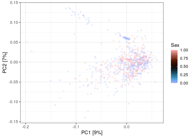
ggplot() +
  geom_point(
    data = plot_data,
    mapping = aes(
      x = pc1,
      y = pc2,
      col = sex
    ),
    alpha = 0.2
  ) +
  xlab(glue("PC1 [{contribution1}%]")) +
  ylab(glue("PC2 [{contribution2}%]")) +
  scale_color_scico(
    name = "Sex",
    palette = "berlin"
  )
Association analysis
:pencil2: Compute the association of the selected protein with one of the disease classes
class <- "Class_1"

samples_tested <- samples_details %>%
  filter(
    group == "Healthy" | group == class
  ) %>%
  mutate(
    group_level = ifelse(group == "Healthy", 0, 1)
  )

current_protein_values <- protein_values %>%
  select(
    id = sample_id,
    abundance = !!sym(selected_protein_log_std)
  )

association_data <- samples_tested %>%
  left_join(
    current_protein_values,
    by = "id"
  ) %>%
  filter(
    !is.na(abundance)
  )

lm_results <- lm(
  formula = "abundance ~ group_level + age + bmi + sex",
  data = association_data
)

summary(lm_results)

##
## Call:
## lm(formula = "abundance ~ group_level + age + bmi + sex", data = association_data)
##
## Residuals:
##     Min      1Q  Median      3Q     Max
## -1.3736 -0.3283 -0.1226  0.2698  6.4926
##
## Coefficients:
##              Estimate Std. Error t value Pr(>|t|)
## (Intercept) -0.153188   0.320226  -0.478   0.6327
## group_level  0.093163   0.097110   0.959   0.3381
## age          0.009273   0.004196   2.210   0.0278 *
## bmi         -0.010061   0.010184  -0.988   0.3240
## sex         -0.039089   0.084630  -0.462   0.6445
## ---
## Signif. codes:  0 '***' 0.001 '**' 0.01 '*' 0.05 '.' 0.1 ' ' 1
##
## Residual standard error: 0.7013 on 309 degrees of freedom
## Multiple R-squared:  0.02357,    Adjusted R-squared:  0.01093
## F-statistic: 1.865 on 4 and 309 DF,  p-value: 0.1165
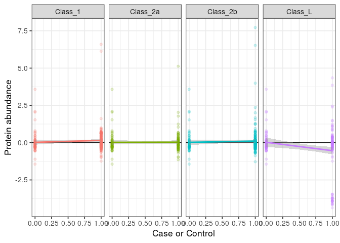
:pencil2: Plot the association with all classes.
classes <- c("Class_1", "Class_2a", "Class_2b", "Class_L")

plot_data <- NULL

for (class in classes) {

  samples_tested <- samples_details %>%
    filter(
      group == "Healthy" | group == class
    ) %>%
    mutate(
      group_level = ifelse(group == "Healthy", 0, 1)
    )

  current_protein_values <- protein_values %>%
    select(
      id = sample_id,
      abundance = !!sym(selected_protein_log_std)
    )

  association_data <- samples_tested %>%
    left_join(
      current_protein_values,
      by = "id"
    ) %>%
    filter(
      !is.na(abundance)
    )

  association_data$class <- class

  plot_data <- rbind(plot_data, association_data)

}


ggplot() +
  geom_hline(
    yintercept = 0
  ) +
  geom_point(
    data = plot_data,
    mapping = aes(
      x = group_level,
      y = abundance,
      col = class
    ),
    alpha = 0.2
  ) +
  geom_smooth(
    data = plot_data,
    mapping = aes(
      x = group_level,
      y = abundance,
      col = class
    ),
    formula = "y ~ x",
    method = "lm"
  ) +
  scale_x_continuous(
    name = "Case or Control"
  ) +
  scale_y_continuous(
    name = "Protein abundance"
  ) +
  facet_grid(
    . ~ class
  ) +
  theme(
    legend.position = "none"
  )
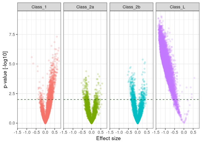
:pencil2: For every protein, run a linear model of every patient class vs healthy taking age, BMI, and sex as covariate.
classes <- c("Class_1", "Class_2a", "Class_2b", "Class_L")

n <- length(classes) * nrow(protein_details)

results <- data.frame(
  class = character(n),
  protein_id = character(n),
  uniprot_id = character(n),
  protein_name = character(n),
  beta = numeric(n),
  se = numeric(n),
  p = numeric(n),
  n = numeric(n),
  stringsAsFactors = F
)

i <- 1

for (class in classes) {

  print(glue("{Sys.time()} - Processing {class}"))

  samples_tested <- samples_details %>%
    filter(
      group == "Healthy" | group == class
    ) %>%
    mutate(
      group_level = ifelse(group == "Healthy", 0, 1)
    )

  for (protein_index in 1:nrow(protein_details)) {

    protein_id <- protein_details$protein_id[protein_index]
    uniprot_id <- protein_details$uni_prot[protein_index]
    protein_name <- protein_details$target_full_name[protein_index]

    col_name <- paste0(protein_id, "_log_std")

    current_protein_values <- protein_values %>%
      select(
        id = sample_id,
        abundance = !!sym(col_name)
      )

    association_data <- samples_tested %>%
      left_join(
        current_protein_values,
        by = "id"
      ) %>%
      filter(
        !is.na(abundance)
      )

    lm_results <- lm(
      formula = "abundance ~ group_level + age + bmi + sex",
      data = association_data
    )

    lm_summary <- summary(lm_results)

    results$class[i] <- class
    results$protein_id[i] <- protein_id
    results$uniprot_id[i] <- uniprot_id
    results$protein_name[i] <- protein_name
    results$beta[i] <- lm_summary$coefficients["group_level", 1]
    results$se[i] <- lm_summary$coefficients["group_level", 2]
    results$p[i] <- lm_summary$coefficients["group_level", 4]
    results$n[i] <- nrow(association_data)

    i <- i + 1

  }

}

## 2022-06-20 17:42:34 - Processing Class_1
## 2022-06-20 17:45:38 - Processing Class_2a
## 2022-06-20 17:48:39 - Processing Class_2b
## 2022-06-20 17:51:34 - Processing Class_L
:pencil2: Plot the significance against the effect size for each comparison.
ggplot() +
  geom_point(
    data = results,
    mapping = aes(
      x = beta,
      y = -log10(p),
      col = class
    ),
    alpha = 0.2
  ) +
  geom_hline(
    yintercept = 2,
    col = "darkgreen",
    linetype = "dashed"
  ) +
  scale_x_continuous(
    name = "Effect size"
  ) +
  scale_y_continuous(
    name = "p-value [-log10]"
  ) +
  facet_grid(
    . ~ class
  ) +
  theme(
    legend.position = "none"
  )
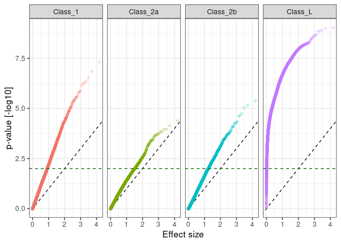
:pencil2: Plot the observed against expected p-value for each class.
qq_data <- results %>%
  group_by(
    class
  ) %>%
  mutate(
    logP = -log10(p)
  ) %>%
  arrange(
    logP
  ) %>%
  mutate(
    expectedLogP = sort(-log10(ppoints(n = n())))
  ) %>%
  ungroup()

ggplot() +
  geom_abline(
    slope = 1,
    intercept = 0,
    color = "black",
    linetype = "dashed"
  ) +
  geom_point(
    data = qq_data,
    mapping = aes(
      x = expectedLogP,
      y = logP,
      col = class
    ),
    alpha = 0.2
  ) +
  geom_hline(
    yintercept = 2,
    col = "darkgreen",
    linetype = "dashed"
  ) +
  scale_x_continuous(
    name = "Effect size"
  ) +
  scale_y_continuous(
    name = "p-value [-log10]"
  ) +
  facet_grid(
    . ~ class
  ) +
  theme(
    legend.position = "none"
  )